

By far, the majority of global website traffic comes from mobile devices; hence, it is an absolute must to optimize your WordPress website for mobile. Whether you’re blogging, running an e-store, or showcasing a business site, mobile optimization provides your visitors with a smooth, fast, and user-friendly experience. Let us look at some action-oriented mobile optimization tips to take your WordPress website one step further.
 1.Choosing a Responsive WordPress Theme
 1.Choosing a Responsive WordPress Theme
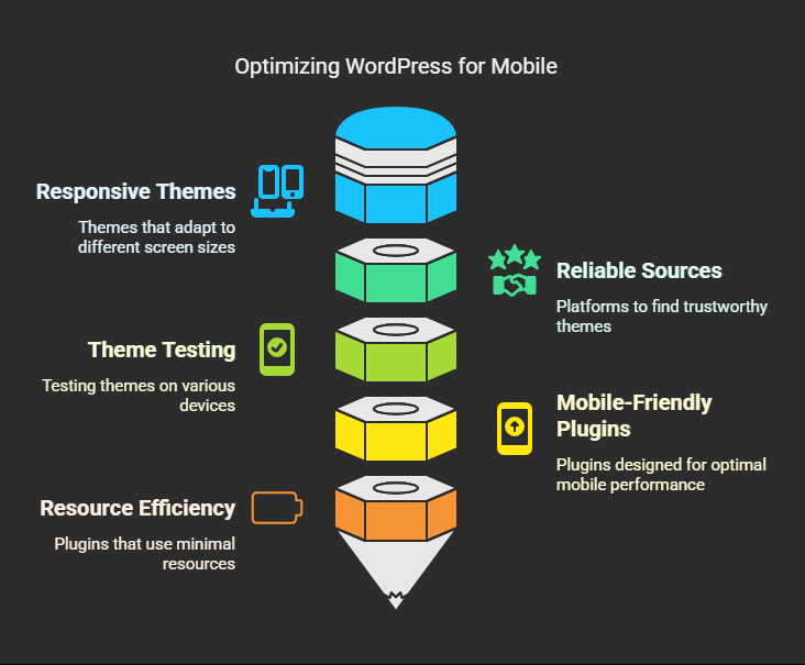
Mobile optimization begins with a responsive theme. A responsive theme adjusts layout and appearance to practically any device’s screen, be it a desktop, tablet, or smartphone.
Tips:
Choose themes from reliable sources, such as the WordPress Repository, ThemeForest, or Elegant Themes.
Test the demo on all devices before making a purchase.
Check your current theme with Google’s Mobile-Friendly Test tool.
Recommended Themes:
➢Astra
➢OceanWP
➢GeneratePress
➢Neve
➢Kadence
2. Assemble a Mobile-Friendly Plugin Stack
Not all plugins are mobile optimized. Some may break layout or cause heavy load on the mobile version of your site. Always choose plugins light on resources and highly coded.
Tips:
➢Perform routine inspections and deactivate or remove plugins you do not use.
➢Check for theme compatibility and mobile responsiveness.
➢Consider using all-in-one plugins like Elementor, WPForms, and Rank Math, which are heavily mobile-focused.
 3. Optimize Images for Mobile Devices
 3. Optimize Images for Mobile Devices
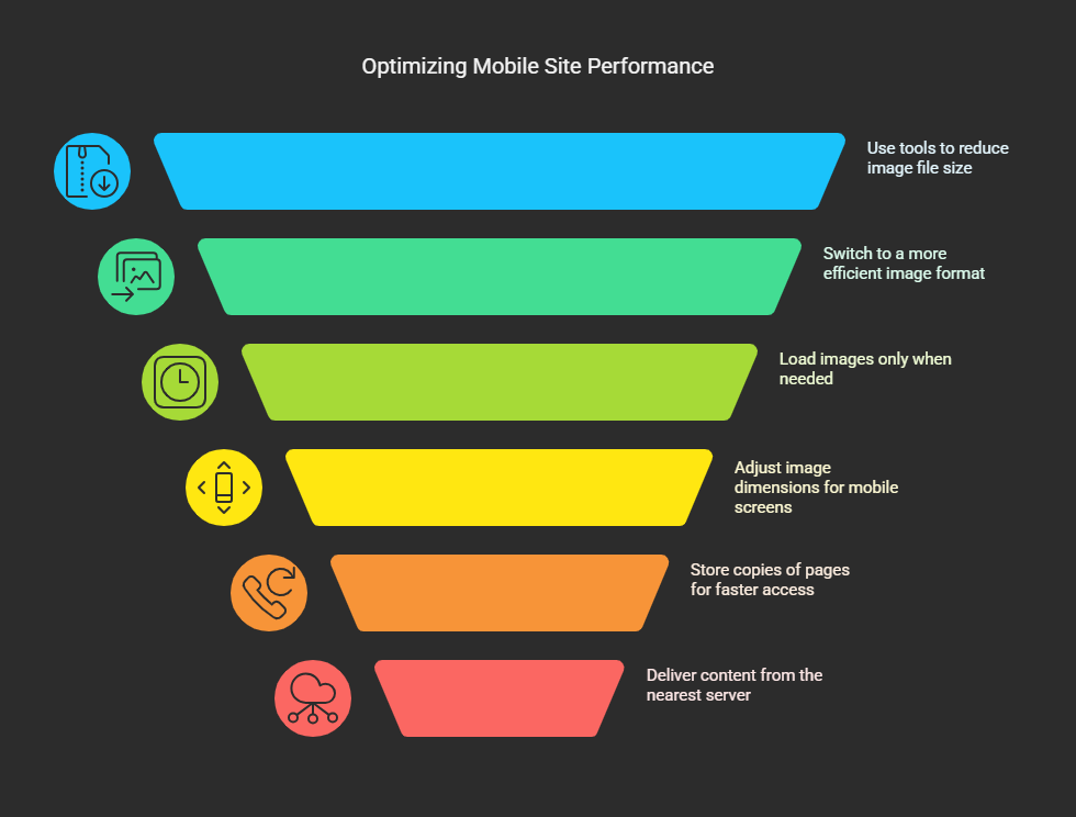
High-resolution image viewing can cripple mobile loading speeds. It is crucial to achieve an ideal balance in the quality and performance of any image.
Tips:
➢Use image compression tools such as TinyPNG, ShortPixel or Smush.
➢Use WebP format for better compressed images.
➢Implement lazy loading to hold off image loading for use until required.
➢Resize images to suit particular mobile displays for a better experience when viewing online content.
4. Mobile caching and CDN
Improving the speed of your mobile site with the caching and content delivery networks (CDNs) can be defined as storing copies of your pages and delivering them from the closest server.
Tools:
➢WP Rocket
➢W3 Total Cache
➢Cloudflare
➢LiteSpeed Cache (especially for LiteSpeed server users)
Tips:
➢Enable caching for mobile.
➢Use browser and object cache.
➢Combine cache with HTML, CSS, and JavaScript minification.
 5. Simplify Navigation in Smaller Screens
 5. Simplify Navigation in Smaller Screens
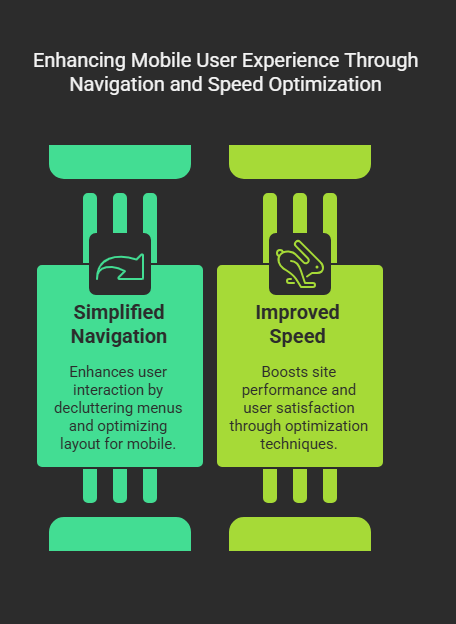
Mobile users behave differently than their desktop counterparts. Tiny menus or overly cluttered layouts frustrate users and subsequently increase bounce rates.
Tips:
➢Use hamburger menus to declutter navigation.
➢Limit menu items.
➢Make tap-friendly buttons and links (at least 48px x 48px) available.
➢Place navigation on top or below for better accessibility via thumb.
6. Speed up mobile site speed
Speed is a ranking factor and worse user experience if not optimized.
Tips:
➢Use lighter themes and plug-ins.
➢Minify and combine CSS and JS files.
➢Enable GZIP compression.
➢Use a fast hosting company optimized for WordPress.
➢Run speed tests using GTmetrix, PageSpeed insights, or Pingdom.
 7. AMP-Accelerated Mobile Pages
 7. AMP-Accelerated Mobile Pages
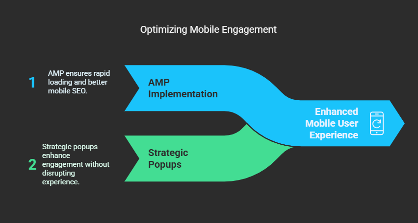
AMP provides a lightweight version of your website for mobile users, emphasizing speed and readability.
Pros:
➢Incredibly fast loading
➢Improved SEO on mobile
Cons:
➢Restrictions on customization
➢Site features may be stripped off
Suggested Plugin:
➢AMP plugin by WordPress.
8. Be Cautious with Mobile Popups
Popups are a great way to do marketing, but they can ruin the experience if done badly on the mobile version.
Tips:
➢Use exit- or scroll-triggered popups.
➢Do not use full-screen popups that block content.
➢Make it easy to close.
➢Use a mobile-optimized popup builder like OptinMonster or Elementor Pro.
 9. Keep Testing Your Mobile Design
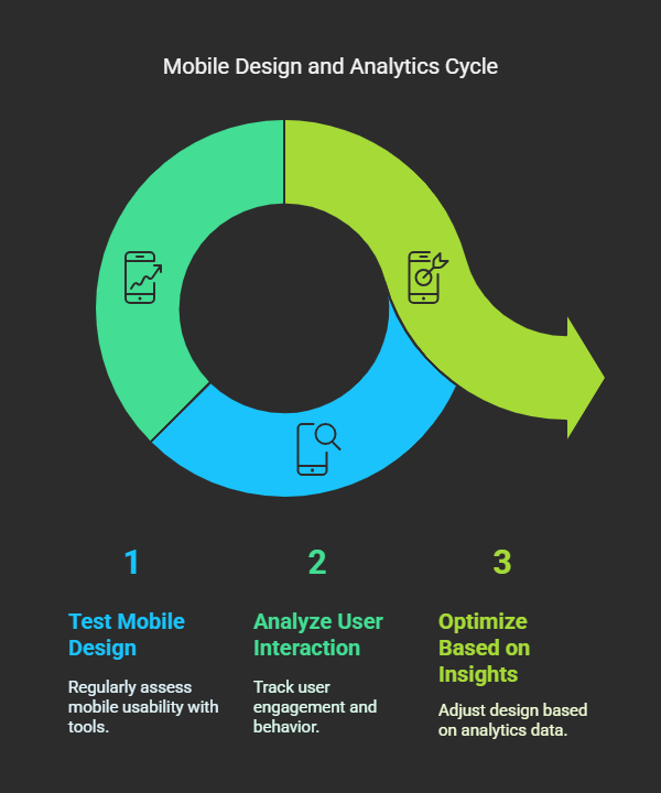 9. Keep Testing Your Mobile Design
Never set it and forget it. Users’ behaviors-and technologies-change with time.
Tools Used:
➢Google mobile-friendly test
➢BrowserStack or Responsinator
➢Chrome DevTools (Toggle device toolbar)
Checklist:
➢Can users read the text without zooming?
➢Can users tap the buttons easily?
➢Is there a difference in layout among the different screen sizes?
10. Enable Tracking for Mobile App Analytics
It is important to understand how users interact with your site on mobile so that you can continuously optimize it.
Tools:
➢Google Analytics 4 (GA4)
➢Hotjar (for heatmaps and session recordings)
➢Microsoft Clarity
Metrics Worth Monitoring:
➢Mobile bounce rate
➢Page load time on mobile
➢Device breakdown
➢Mobile conversion rate
Conclusions
This optimization is not something you do once and then forget about; optimization for mobile is an ongoing strategy. As mobile devices change and evolve, so too will the mobile website. With the best tools, strategies, and testing, your WordPress site will deliver a seamless experience to each and every mobile visitor.
Be it a novice or pro in WordPress, keeping up with modern technology is key to attracting traffic and thus a better rank and increased conversions. Start applying these tips right away and watch your performance with mobile absolutely fly!